Austin Pietrobono
Plex_Thumbnail_nobars.png

PLEX TYPEFACE FILM


PLEX TYPEFACE FILM

After years of development, IBM was ready to unveil its own typeface, IBM Plex. To debut the project both internally and externally to the design community, our team created an introduction film showcasing the strategy, inspiration, and development of the Plex typeface.

Working closely with Mike Abbink, I created all the motion graphics for the film, translating the team’s documentation into segments that detail the anatomy and finer details of Plex. I also helped to refine the overall narrative for the film, and produced graphics used to shoot the primary scenes.


TEAM

Mike Abbink (Creative Direction), Michael Gramaglia (Director)

LINKS

Fast Company, Plex website

 
Plex_8bar_01.png
Plex_Quant_UImockup.jpg
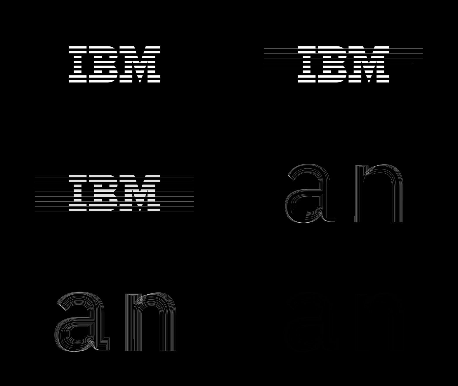
Details in the glyphs of the Plex typeface are derived from Paul Rand’s iconic ‘Eight Bar’ logo.

Details in the glyphs of the Plex typeface are derived from Paul Rand’s iconic ‘Eight Bar’ logo.

 
I hear music when I see certain fonts.
— Jon Iwata, Chief Marketing Officer
 
PlexFilm_BehindtheCam.jpg
Plex_MikeAbbink.JPG
Plex’s design evokes the relationship between man and machine that characterizes the IBM brand as a whole.

Plex’s design evokes the relationship between man and machine that characterizes the IBM brand as a whole.

Plex has since replaced all of IBM’s previous corporate typefaces across brand, marketing, and product, and is available open source on Google Fonts.

 
Great design is a manifestation of great thinking.
— Teresa Yoo, Vice President Brand Strategy and Experience Design
Eight bars in the IBM logo, eight weights of the Plex typeface.

Eight bars in the IBM logo, eight weights of the Plex typeface.

Mike_PanningAboveShot.png